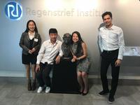
IE student team wins 3rd in 2017 Medicaid Data Challenge competition
The State of Indiana recently "de-identified" (publicly released) a large amount of Indiana Medicaid healthcare information to help support better data-driven decisions in healthcare. This data provides a wealth of information on the Indiana Medicaid population and the providers who serve them. Because of this, the Indiana Chapter of HIMSS created the Data Challenge, the first competition to use this newly-available Medicaid data. Hosted by the Regenstrief Institute, the event challenged teams to develop and demonstrate the most innovative use of the data.
After hearing about this challenge from IE Professor Yuehwern Yih, senior IE student Pamela Yuan formed a team with IE PhD students Esmaeil Bahalkeh and Shangyuan Ma, IE Master's student Ellen Wongso, and statistics PhD student Qi Liu, and created a deliverable and a presentation in four days. They discussed: “How are we to use technology to tell a story?", "What technology?", "What story – do we create an algorithm or is that too analytics-heavy?", "Who is our audience and what value does our story add to Medicaid?" and even "What is Medicaid?"
"Our team of five worked tirelessly...to use creative and innovative technology to bring a story to life, through data visualization, that impacts widespread public health," said team member Yuan. The team met for at least three hours a night from October 17-20. The presentation took place four days later on October 21, to a panel of 10 judges and an audience of about 50 teams, at the Regenstrief Institute in Indianapolis.
"For someone who had never seen Medicaid data before, this is quite an accomplishment," said Dr. Paul Griffin, St. Vincent Health Chair of Healthcare Engineering and Director of the Purdue University Regenstrief Center for Healthcare Engineering.
The "Purdue IE" student team's deliverable was to develop an aggregate database to maximize the total number of recipients and minimize the annual total costs. They created three scenarios:
- "ideal" - increasing the total number of recipients while decreasing the total dollars of claims
- "normal" - increasing the total numbers of recipients while increasing the total dollars of claims
- "worst" - decreasing the total number of recipients while increasing the total dollars of claims.
To accomplish this, they chose to create/publish a dashboard robust enough to upload any of the given data so that there was a way to connect all the random data sets in the database.
After finalizing the dashboard and presentation, the team made a three-minute presentation to the competition committee. "Many judges commented on how polished and simple our visualization looked as well as how cohesive the logic of our presentation was," said Yuan. "Most teams had beautiful diagrams and pictures but failed to tell the story in a concise and direct manner, so I’m glad our team made extra efforts to make sure everything we presented and created followed the objective function."
Yuan summarized in 10 steps their data challenge process:
- Assemble team based on skill sets/credentials needed to thrive in the chosen track (Data visualization)
- Make a flowchart seeing how the data in the given database are connected
- Define each element of the flowchart/audience to frame how the deliverable will add value to the audience
- Have a high level brainstorm session with all the data sheets, to ensure each member has the same understanding of the data elements, and to try to find a theme/story
- If no winning story idea comes from looking at the data details together split the data up among team members and have each individual look closer into their data and present at least one story line, with additional research
- Hold a hearing for each individual story idea, narrow down the story to one
- Fuse elements of the objective functions (“story” and “creative technologies”) to finalize the product
- Remove any distracting visuals from the presentation and review logical structure of the verbal presentation, making sure emphasizes the event objective
- Practice timing the presentation with the speaker/clicker with the correct and final presentation
- Present and be proud!
3-Minute Presentation Script and Dashboard
Writer: DeEtte Starr, starrd@purdue.edu

